TenderCulture - Library MVP
This project was particularly satisfying as it marked my first time using Tailwind UI. As we reflect on this project, I had already been working on Poddium for a couple of months. During this time, I found that our production process was too cumbersome for just two developers and one product owner. Our product owner, Germain Chittaro, consistently produced fantastic designs, but occasionally, the font sizes or margins were not precise. From my perspective, his focus seemed overly centered on graphic details, which, while excellent, often resulted in longer development and shipping times.
Therefore, I proposed that he continue creating outstanding mockups but suggested that he begin by using the Tailwind UI library components as a starting point and then adapt them to his graphic ideas.
Visit the website
Our stack for this project
Germain did a great job by designing the TenderCulture Library and helping me identify the inspired components on Tailwind UI. It only took me two months of part-time work to deliver the MVP.
On my side, I did my best to implement best practices for reusing components.
For example, let's see if you recognize this seller block on the homepage?
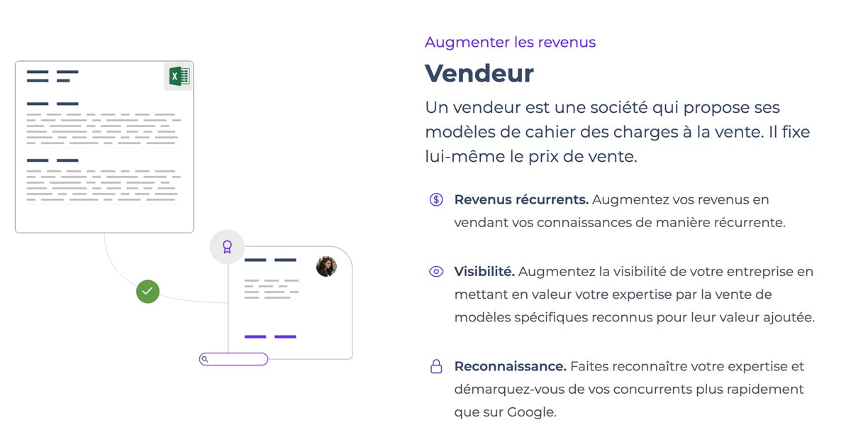
It's a variation of this Tailwind UI component.
And this is how I worked on improving its reusability with NextJS 14.
"use client";

import { Text, Title } from "@/components/common/Typography"
import Heading from "@/components/common/heading"
import { AcademicCapIcon, ClockIcon, CurrencyDollarIcon, EyeIcon, LockClosedIcon, PencilSquareIcon } from "@heroicons/react/24/outline"
import classNames from "classnames"
import { useTranslations } from "next-intl"
import Image from "next/image"
import { ForwardRefExoticComponent, SVGProps } from "react"

interface ProcessCardProps {
image: string;
subtitle: string;
title: string;
description: string;
features: {
name: string;
description: string;
icon: ForwardRefExoticComponent<SVGProps<SVGSVGElement>>;
}[];
reverse?: boolean;
t: any;
}

export function ProcessCard({ image, subtitle, title, description, features, reverse, t }: ProcessCardProps) {
  return (
    <div className="overflow-hidden">
      <div className="max-w-container">
        <div className="mx-auto grid w-full max-w-5xl grid-cols-1 justify-between gap-x-8 gap-y-16 sm:gap-y-20 lg:grid-cols-2 lg:items-start">
          <div className={classNames(reverse && "md:order-last", "lg:pr-4 lg:pt-4")}>
            <div className="mx-auto max-w-2xl space-y-2 lg:mx-0 lg:max-w-lg">
              <Title tag={Title.tag.H4} size={Title.size.MEDIUM} color={Title.color.PRIMARY}>
                {t(subtitle)}
              </Title>
              <Title tag={Title.tag.H3} size={Title.size.XXLARGE} weight={Title.weight.BOLD}>
                {t(title)}
              </Title>
              <Text size={Text.size.LARGE} color={Text.color.DARK}>
                {t(description)}
              </Text>
              <div>
                <dl className="mt-6 max-w-xl space-y-8 leading-7 text-gray-600 lg:max-w-none">
                  {features.map((feature) => (
                    <div key={feature.name} className="relative pl-9">
                      <dt className="inline font-semibold text-dark">
                        <feature.icon className="absolute left-1 top-1 h-5 w-5 text-indigo-600" aria-hidden="true" />
                        {t(feature.name)}
                      </dt>{" "}
                      <dd className="inline">{t(feature.description)}</dd>
                    </div>
                  ))}
                </dl>
              </div>
            </div>
          </div>
          <Image
            src={process.env.NEXT_PUBLIC_APP_URL + image}
            alt="placeholder"
            className={classNames(reverse ? "ml-0" : "mr-0", "relative mx-auto overflow-hidden sm:px-6 lg:px-0")}
            width={465}
            height={465}
            quality={100}
          />
        </div>
      </div>
    </div>
  );
}

export default function Process() {
  const t = useTranslations("home_page.process_component");
  return (
    <div className="container mx-auto">
      <Heading badge={t("badge")} title={t("title")} subtitle={t("subtitle")} />
      <div className="space-y-16 md:space-y-32">
        <ProcessCard
          subtitle="process_1.subtitle"
          title="process_1.title"
          description="process_1.description"
          image="/uploads/Visuel_site_buyer.png"
          features={[
            {
              name: "process_1.features_1.name",
              description: "process_1.features_1.description",
              icon: ClockIcon,
            },
            {
              name: "process_1.features_2.name",
              description: "process_1.features_2.description",
              icon: AcademicCapIcon,
            },
            {
              name: "process_1.features_3.name",
              description: "process_1.features_3.description",
              icon: PencilSquareIcon,
            },
          ]}
          t={t}
        />
        <ProcessCard
          subtitle="process_2.subtitle"
          title="process_2.title"
          description="process_2.description"
          image="/uploads/Visuel_site_seller.png"
          features={[
            {
              name: "process_2.features_1.name",
              description: "process_2.features_1.description",
              icon: CurrencyDollarIcon,
            },
            {
              name: "process_2.features_2.name",
              description: "process_2.features_2.description",
              icon: EyeIcon,
            },
            {
              name: "process_2.features_3.name",
              description: "process_2.features_3.description",
              icon: LockClosedIcon,
            },
          ]}
          t={t}
          reverse
        />
      </div>
    </div>
  );
}
What do you think ? I added reverse props just to switch the sides and apply the same component above or below.
The overall app is based on these principles, using this approach to build components.